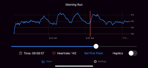
Pokecoach: Using Haptic and Audio Feedback to Visualize Time-series Data
A project I did for a visualization course I took at University of Maryland. Sonification, i.e., using variable-pitched sounds to visualize data, is an interesting approach utilized by researchers to make time-series graphs accessible for people who are blind and low-vision. SwiftUI has an interesting API for programming various haptic intensities for iOS devices, so I took that idea and thought whether smartphone vibrations can be used to visualize time-series data. I implemented the following haptic designs for the app:
- Continuous Haptic Feedback: the intensity of the vibration represents the y-axis value, which is the heart rate. The vibration increases when the value is higher, and decreases when the value gets lower.
- Frequency-based Haptic Feedback: like Morse code, very short vibrations are produced based on the y-axis value. This represents the heart rate, where there will be a high frequency of short vibrations when the value gets higher, and a lower frequency when the value gets lower.
You can find more details in my Medium article. Check out the source code here.